
Carousel Properties allows you to have rotating images on the home page of your app. These images can then be linked to various content inside (or outside) the Membership and Events app. Click on the second gray bar on the right to access the Carousel Properties. The bar will turn orange.
- Click HERE to view the Membership/Community Home Page App Designer training video.
- Click HERE to view the Event Home Page App Designer training video.
Carousel Properties (All Cards)
The top section is where you will find the carousel image height, width, display time, and auto rotation settings that apply to all images within the carousel.
Height
Click in the “Height” box to change the existing height. The default height is set to 188 pixels so the recommended specs are 1280 (w) x 720 (h). The width of the carousel images is fixed, but the height is adjustable. All Carousel Cards need to be the same height.
Suggested height is 80-240 pixels. The recommended specs change based on the selected height. Click 'Choose Image' or 'Replace Image' in the side properties bar to view the specs.
For sponsor banners, use smaller image image heights and for information banners, use larger image heights. NOTE: Always adjust the image height before uploading your image.
Width
The width is fixed and cannot be changed.
Display (Seconds)
Click in the “Display (Seconds)” box to change the length of time a carousel image displays in seconds. The default is set to 3 seconds, but can be changed. NOTE: If you change the display seconds, it will apply to all images in the carousel.
Auto Rotation
Click the toggle button next to “Auto Rotation” to turn off having your images auto rotate.
Carousel Properties (Individual Cards)
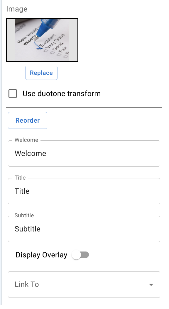
Image
Click "Image" and select "Add" or "Replace" to upload an image. All images must be in PNG format. NOTE: Image load times are directly impacted by the image file size.
Welcome, Title, and Subtitle
These text fields only appear when the Display Overlay is enabled (toggled on) and allows you can enter whatever text you desire in any or all of these fields. The height of the overlay will change, depending if you choose to fill in all or some of these fields.
Display Overlay
The current view applies a transparent overlay that displays text. Click on the toggle button to remove the overlay.
Link to Options (Membership)
You can select to link the image to a URL, Survey, HTML, Directory, Event or Event List. Once you make a selection, then an additional box will appear based on the selection you made. NOTE: The "Link To" field can be left blank, if you wish to only display an image.
- URL - Allows you to enter in a link in the url box that appears after making this selection.
- Survey - Allows you to select a survey that you have created in the admin console.
- HTML - Similar to a word document, where you can add text, links, photos, change font size, color, etc.
- Directory - Allows you to add a directory to the carousel that has been created in the admin console.
- Event - Allows you to select an event in the events field box that will take users to that events home page.
-
Event List - Allows you to direct users to a list of all your active events that have been created in the admin console. Once a user selects an event from that event list, then they will be taken to that events home page.
Link to Options (Events)
You can select to link the image to a URL, Welcome, Page, Survey or HTML. Once you make a selection, then an additional box will appear based on the selection you made. NOTE: The "Link To" field can be left blank, if you wish to only display an image.
- URL - Allows you to enter in a link in the url box that appears after making this selection
- Welcome - Shows the information you have entered in the 'Description' section under the 'Details' tab in your event.
- Page - Allows you to select a specific sponsor or speaker profile page that you have created.
- Survey - Allows you to select a survey that you have created in the admin console.
- HTML - Similar to a word document, where you can add text, links, photos, change font size, color, etc.
Saving Changes
- Click the "Save" button at the top right corner for any changes made in the "Carousel Properties" or "Card 1 of 1".
Adding Carousel Images
- Click on a green + button to the right or left of an existing carousel image. This will bring up a new carousel properties page.
Reorder Carousel Items
- Click on the "Reorder" button under an image.
- Drag and drop the images in the order you want.
- Click "Save".
Deleting Carousel Images
Click on the gray "X" button located in the top right corner of a selected image.